
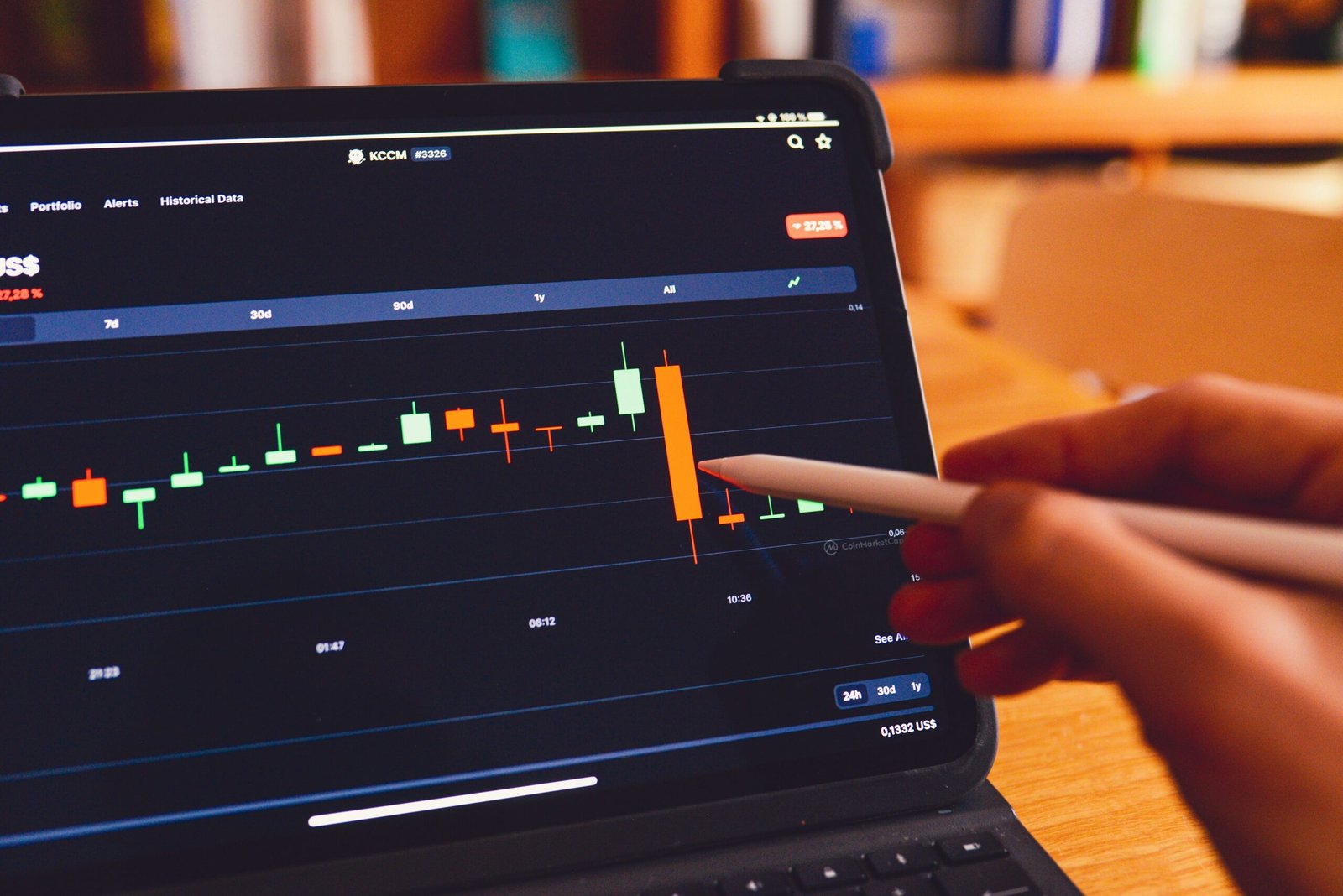
If you spend even a few minutes looking at a trading platform, you will quickly notice that most traders use candlestick charts. These charts are one of the most popular tools in financial markets because they provide a clear and detailed view of price movements. Whether you trade stocks, forex, commodities, cryptocurrencies, or indices, understanding candlestick charts is an important skill.
For beginners, candlestick charts may look confusing at first. The various colors, shapes, and patterns can seem overwhelming. However, once you understand the basics, candlestick charts become much easier to read. In fact, they can provide valuable information about market sentiment, price direction, and potential trading opportunities.
Learning how to read candlestick charts does not mean you will predict every market movement correctly. Instead, it helps you understand what buyers and sellers are doing and how prices are behaving over time.
In this guide, we will explain candlestick charts in simple terms and cover everything a beginner needs to know to start reading them with confidence.
What Is a Candlestick Chart?
A candlestick chart is a visual representation of price movements over a specific period.
Each candlestick shows four important pieces of information:
- Opening price
- Closing price
- Highest price
- Lowest price
Instead of displaying prices as a simple line, candlestick charts provide more detail about what happened during a specific time period.
This additional information helps traders understand market activity more clearly.
Candlestick charts are widely used because they make it easier to identify trends, momentum, and potential reversals.
The History of Candlestick Charts
Candlestick charting originated in Japan several centuries ago.
Japanese rice traders developed this method to analyze market behavior and price movements.
Over time, traders around the world adopted candlestick charts because of their effectiveness and simplicity.
Today, candlestick charts are used across nearly every financial market.
Despite advances in technology and trading tools, candlestick analysis remains one of the most widely used methods of studying price action.
Understanding the Structure of a Candlestick
Every candlestick consists of two main parts:
- The body
- The wicks (sometimes called shadows)
Understanding these components is the first step toward reading candlestick charts.
The Body
The body represents the difference between the opening price and the closing price.
A large body indicates strong buying or selling activity.
A small body suggests weaker market movement during that period.
The body provides valuable information about who was in control of the market.
The Wicks
The thin lines above and below the body are called wicks.
The upper wick shows the highest price reached during the period.
The lower wick shows the lowest price reached during the period.
Wicks reveal how far prices moved beyond the opening and closing levels.
They can provide clues about market rejection and trader sentiment.
Bullish and Bearish Candles
Candlesticks are usually displayed using two different colors.
The specific colors vary depending on the trading platform, but the concept remains the same.
Bullish Candles
A bullish candle forms when the closing price is higher than the opening price.
This indicates that buyers were stronger than sellers during that period.
Bullish candles often suggest upward momentum.
Many platforms display bullish candles in green.
Bearish Candles
A bearish candle forms when the closing price is lower than the opening price.
This indicates that sellers were stronger than buyers.
Bearish candles often suggest downward pressure.
Many platforms display bearish candles in red.
Understanding the difference between bullish and bearish candles is essential for interpreting price action.
Choosing a Timeframe
Candlestick charts can be viewed on different timeframes.
Common timeframes include:
- 1 minute
- 5 minutes
- 15 minutes
- 1 hour
- 4 hours
- Daily
- Weekly
- Monthly
Each candlestick represents one period of the selected timeframe.
For example:
- On a 1-hour chart, each candle represents one hour.
- On a daily chart, each candle represents one day.
- On a weekly chart, each candle represents one week.
The timeframe you choose depends on your trading style and objectives.
What Candlesticks Reveal About Market Sentiment
Candlestick charts provide insights into the ongoing battle between buyers and sellers.
When buyers dominate, prices tend to rise.
When sellers dominate, prices tend to fall.
The shape and size of candlesticks often reveal who has control of the market.
Large bullish candles suggest strong buying interest.
Large bearish candles suggest strong selling pressure.
Small candles may indicate uncertainty or indecision.
By studying candlestick behavior, traders can better understand market sentiment.
Understanding Trend Direction
Candlestick charts make it easier to identify trends.
Uptrend
An uptrend occurs when prices consistently make higher highs and higher lows.
In an uptrend, bullish candles often appear more frequently.
Buyers generally maintain control of the market.
Downtrend
A downtrend occurs when prices consistently make lower highs and lower lows.
Bearish candles often dominate during downtrends.
Sellers maintain greater influence over price movements.
Sideways Market
Sometimes prices move within a range rather than trending upward or downward.
This is known as a sideways or ranging market.
Candlestick charts help traders identify these conditions and adjust their strategies accordingly.
The Importance of Candle Size
The size of a candlestick can provide important information.
Large Candles
Large candles usually indicate strong momentum.
A large bullish candle suggests aggressive buying.
A large bearish candle suggests aggressive selling.
Large candles often appear during major market moves.
Small Candles
Small candles suggest reduced momentum or market indecision.
When buyers and sellers are evenly matched, candles often become smaller.
Periods of consolidation frequently contain smaller candlesticks.
Common Candlestick Patterns Beginners Should Know
Candlestick patterns are combinations of one or more candles that may indicate potential market behavior.
While patterns should never be used alone, they can provide useful clues when combined with other forms of analysis.
Doji
A Doji forms when the opening and closing prices are very close to each other.
The candle body appears extremely small.
This pattern often signals market indecision.
Neither buyers nor sellers were able to gain clear control.
Dojis frequently appear before trend reversals or periods of consolidation.
Hammer
A Hammer has a small body near the top and a long lower wick.
This pattern often appears after a market decline.
The long lower wick suggests sellers pushed prices lower, but buyers eventually regained control.
Many traders view the Hammer as a potential bullish reversal signal.
Shooting Star
A Shooting Star has a small body near the bottom and a long upper wick.
This pattern often appears after a market rise.
It suggests buyers initially pushed prices higher but sellers later took control.
The Shooting Star may indicate a possible bearish reversal.
Bullish Engulfing Pattern
A Bullish Engulfing pattern occurs when a large bullish candle completely covers the previous bearish candle.
This pattern may signal increasing buying pressure.
Many traders interpret it as a potential bullish reversal.
Bearish Engulfing Pattern
A Bearish Engulfing pattern occurs when a large bearish candle completely covers the previous bullish candle.
This pattern may indicate growing selling pressure.
It is often viewed as a potential bearish reversal signal.
Support and Resistance Levels
Candlestick charts become even more powerful when combined with support and resistance analysis.
Support
Support is a price level where buying interest tends to increase.
Prices often struggle to move below support levels.
Resistance
Resistance is a price level where selling pressure tends to increase.
Prices often struggle to move above resistance levels.
Candlestick patterns forming near support or resistance areas may provide stronger trading signals.
Avoid Relying on One Candle
A common beginner mistake is making decisions based on a single candlestick.
One candle rarely tells the complete story.
Experienced traders analyze:
- Multiple candles
- Trend direction
- Market structure
- Volume
- Support and resistance levels
Looking at the broader context helps improve decision-making.
Combining Candlestick Analysis With Other Tools
Candlestick charts work best when used alongside other analytical methods.
Popular tools include:
- Trend lines
- Moving averages
- Relative Strength Index (RSI)
- MACD
- Volume analysis
Combining multiple forms of analysis can help traders gain a more complete understanding of market conditions.
Practicing Candlestick Reading
Like any skill, candlestick analysis improves with practice.
Beginners can strengthen their understanding by:
- Reviewing historical charts
- Identifying patterns
- Observing trends
- Using demo accounts
- Studying real market examples
The more charts you analyze, the more comfortable you become with reading price action.
Consistency and observation are key to developing confidence.
Common Beginner Mistakes
When learning candlestick charts, beginners often make mistakes such as:
- Overanalyzing every candle
- Ignoring trend direction
- Trading solely on patterns
- Neglecting risk management
- Entering trades without confirmation
Avoiding these mistakes can improve learning and reduce unnecessary losses.
Final Thoughts
Candlestick charts are one of the most valuable tools available to traders. They provide a simple yet detailed view of market activity by showing opening prices, closing prices, highs, and lows within a specific period. By learning to read candlesticks, traders gain a better understanding of market sentiment, trend direction, and potential trading opportunities.
For beginners, the key is to focus on the basics before diving into advanced patterns and strategies. Understanding bullish and bearish candles, recognizing common candlestick formations, and observing how prices react around support and resistance levels can build a strong foundation for future learning.
Candlestick analysis is not about predicting every market move perfectly. Instead, it helps traders make more informed decisions by understanding the behavior of buyers and sellers. With regular practice and continuous learning, candlestick charts can become an essential part of any trader’s toolkit.